



The Psychology of Colour
Why We're Drawn to Certain Colours
Colour is more than something we see—it shapes how we experience the world.
Before we notice texture, before we appreciate craftsmanship, and often before we consciously register an object, we notice its colour.
It's one of the fastest pieces of information our brains process.
For centuries, artists, designers and psychologists have been fascinated by the relationship between colour and emotion. While colour doesn't determine how we feel in a simple or universal way, research suggests it plays a meaningful role in perception, influencing the way we interpret environments, products and even our own emotional experiences.
At Nooan, colour isn't chosen because it's fashionable.
It's chosen because of the feeling it evokes.
Our FW2026 palette is inspired by the landscapes of Aotearoa—places that naturally invite calm, warmth, reflection and renewal.

Why Does Colour Affect Us?
The human brain has evolved alongside nature for thousands of years.
Long before cities and digital screens, colour provided information essential for survival.
A deep blue sky signalled clear weather.
Fresh green vegetation suggested growth and abundance.
Golden light meant warmth and the beginning of a new day.
Dark earth represented shelter and stability.
Although modern life looks very different, many psychologists believe these natural associations continue to influence how we experience colour today.
Rather than colour having fixed meanings, our brains connect colours with memories, environments and experiences we've repeatedly encountered throughout life.
This is why colours can feel familiar before we even understand why.

Colour Is Personal
Colour psychology isn't about rules—it's about connection.
While research shows that many people associate certain colours with similar emotions, our response to colour is also shaped by our own memories, experiences and the environments around us. A colour that feels calming to one person may evoke something entirely different for another.
What makes colour so powerful isn't simply the shade itself, but the meaning we give it.
More Than Something You Wear
The colours we choose often reflect how we want to feel.
Sometimes we're drawn to calming blues. Other days, we seek the comfort of warm earth tones or the optimism of soft golden hues. Colour becomes a quiet expression of who we are, and sometimes, who we need to be.
| 🩵 Malibu Blue | Calm | Clarity | Quiet Moments |
| 🌸 Festival Bloom | Joy | Creativity | Optimism |
| 🌿 Going Green | Renewal | Balance | Growth |
| 🌰 Nuthatch | Grounding | Stability | Nature |
| 🧈 Custard | Warmth | Comfort | Happiness |
| ☕ Turkish Coffee | Strength | Security | Grounding |
| 🤍 Marshmellow | Peace | Simplicity | Softness |
| 💎 Lapis | Balance | Confidence | Depth |
Our FW2026 collection was designed with intention—from the colours we chose to the natural fibres we craft with. Because true luxury isn't about standing out; it's about how something makes you feel, every time you wear it.
Read more
Most people don't think about their feet until they hurt. Yet our feet are among the most remarkable structures in the human body. They carry us through life, connect us to the world beneath us, co...
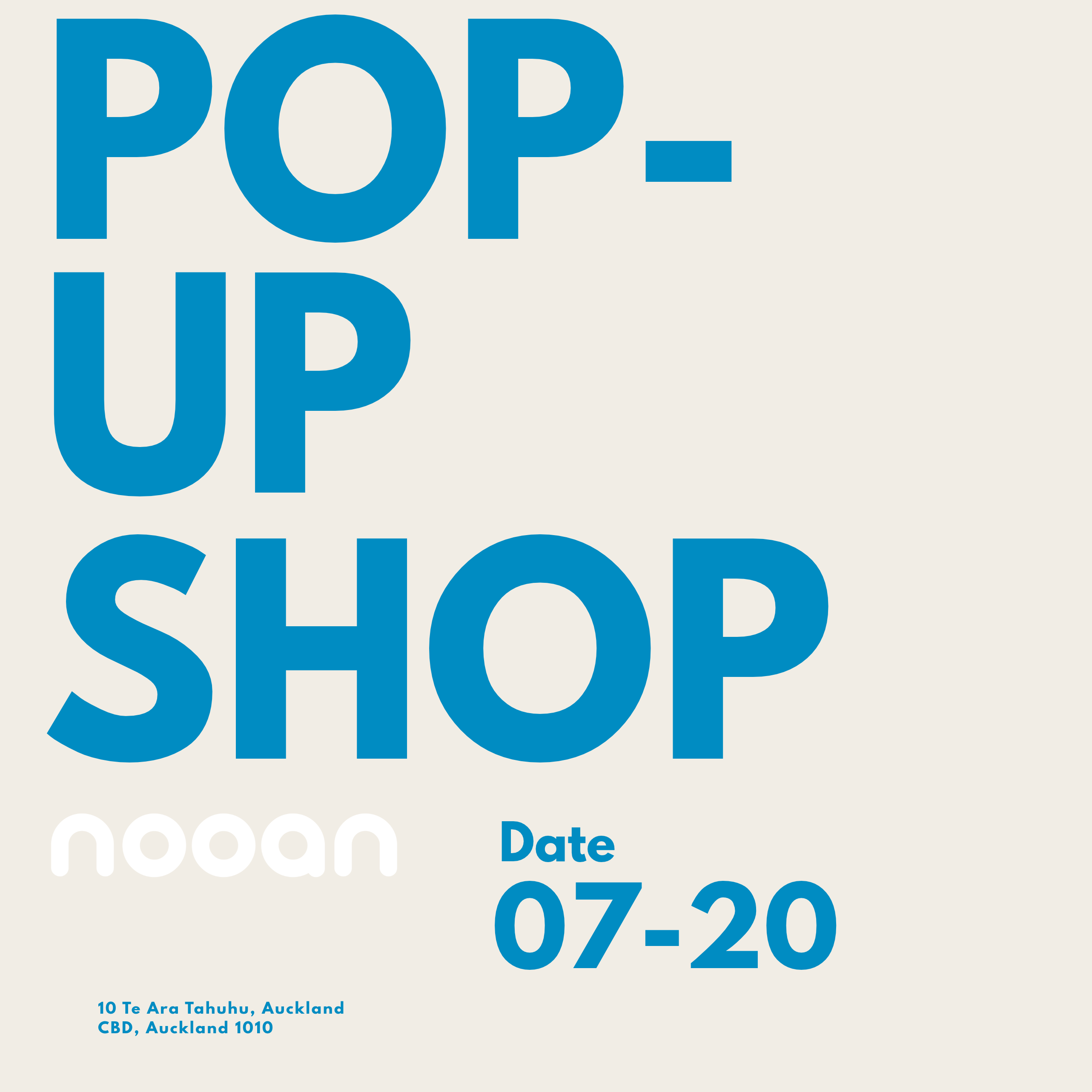
This September, we’re bringing a little more softness to Britomart. For two weeks, we’re creating a space where you can step into the world of Nooan, slow down for a moment and experience our socks...